


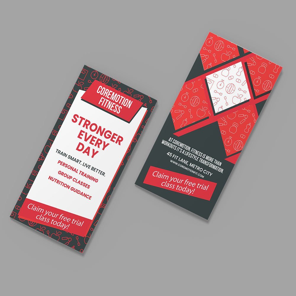

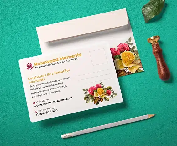



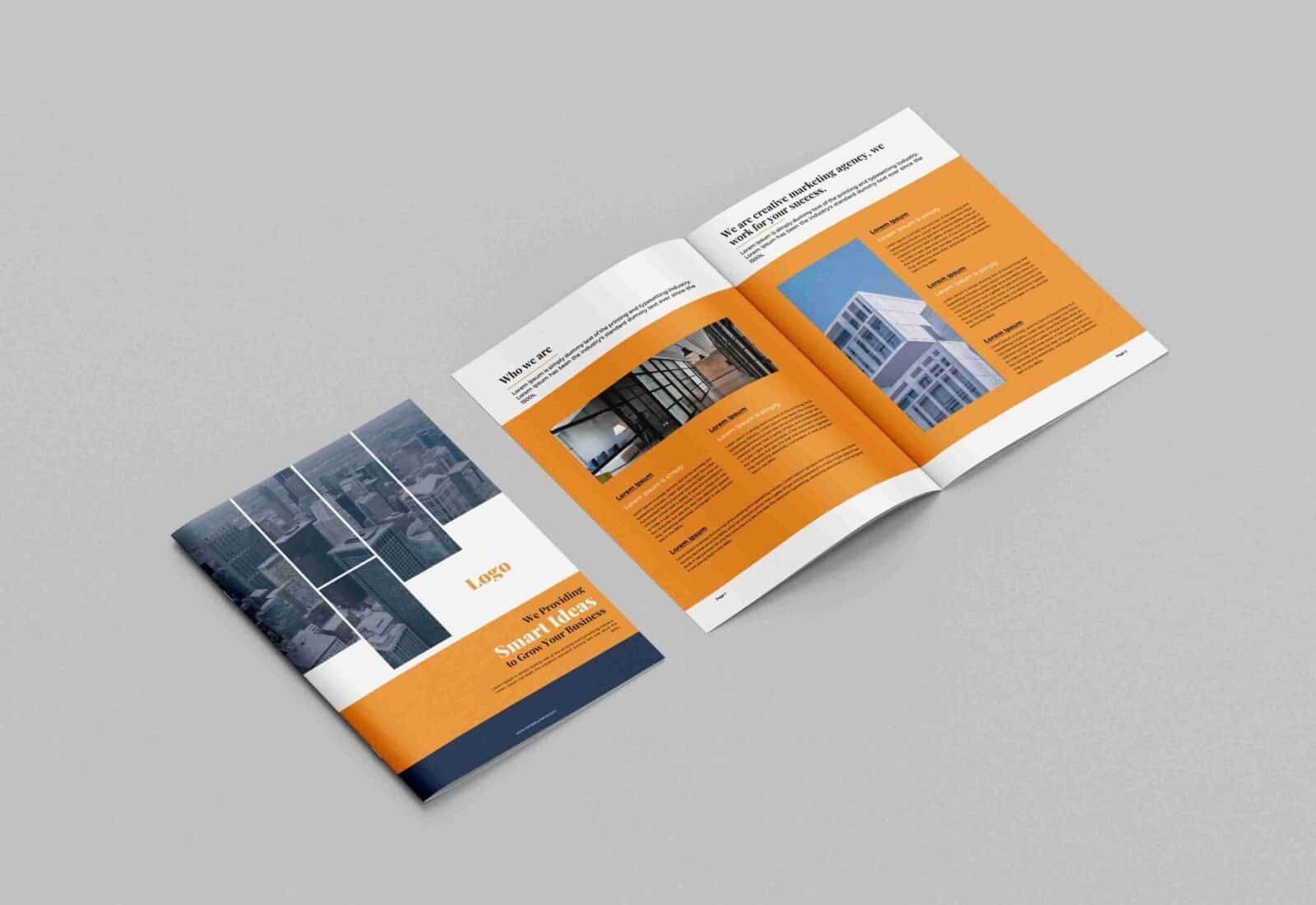


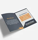
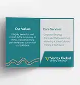
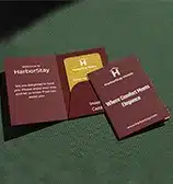















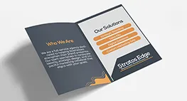
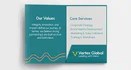
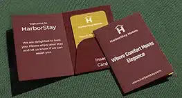














Tri-Fold vs Bi-Fold vs Z-Fold vs Gate-Fold Brochures: Layout Guide
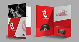
In commercial sales, trade show marketing, and corporate communications, brochures remain one of the most versatile physical collateral formats available.

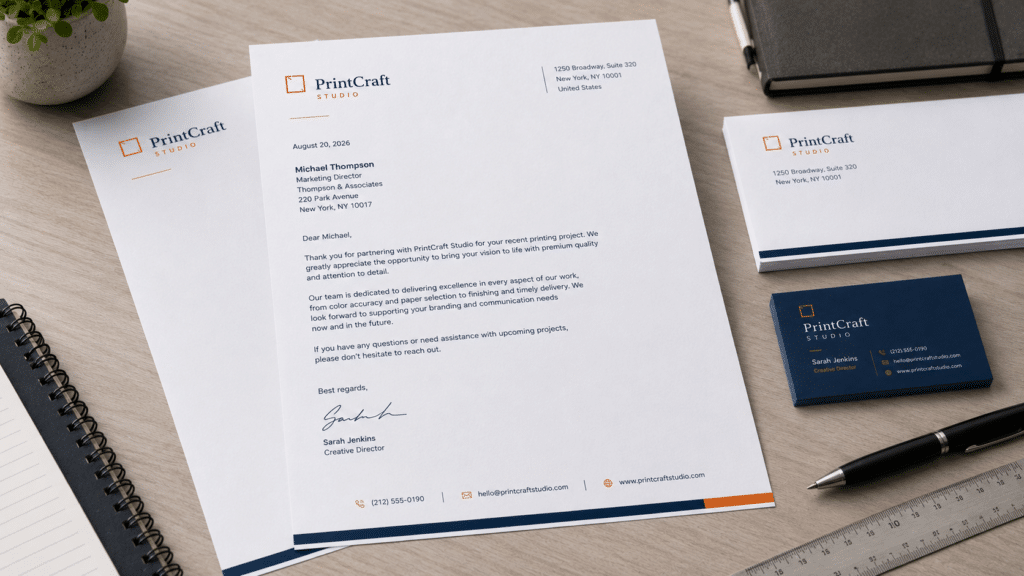
In formal corporate communications, legal notifications, executive proposals, and official invoicing, physical correspondence carries legal and operational weight that digital messages cannot replicate. Handing an executive a printed agreement or mailing an official corporate notice on branded stationery immediately reinforces brand authority, corporate legitimacy, and attention to detail.
A poorly structured page featuring low-resolution logos, cramped text margins, or cheap desktop copy paper undermines your credibility before a client reads a single line. Conversely, investing in strategic letterhead design creates an intuitive, balanced framework for your written messages.
Understanding how to construct a clean layout, establish proper typographic hierarchy, select tactile paper stocks, and execute custom letterhead printing helps businesses build an authoritative physical presence across the United States.
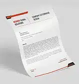
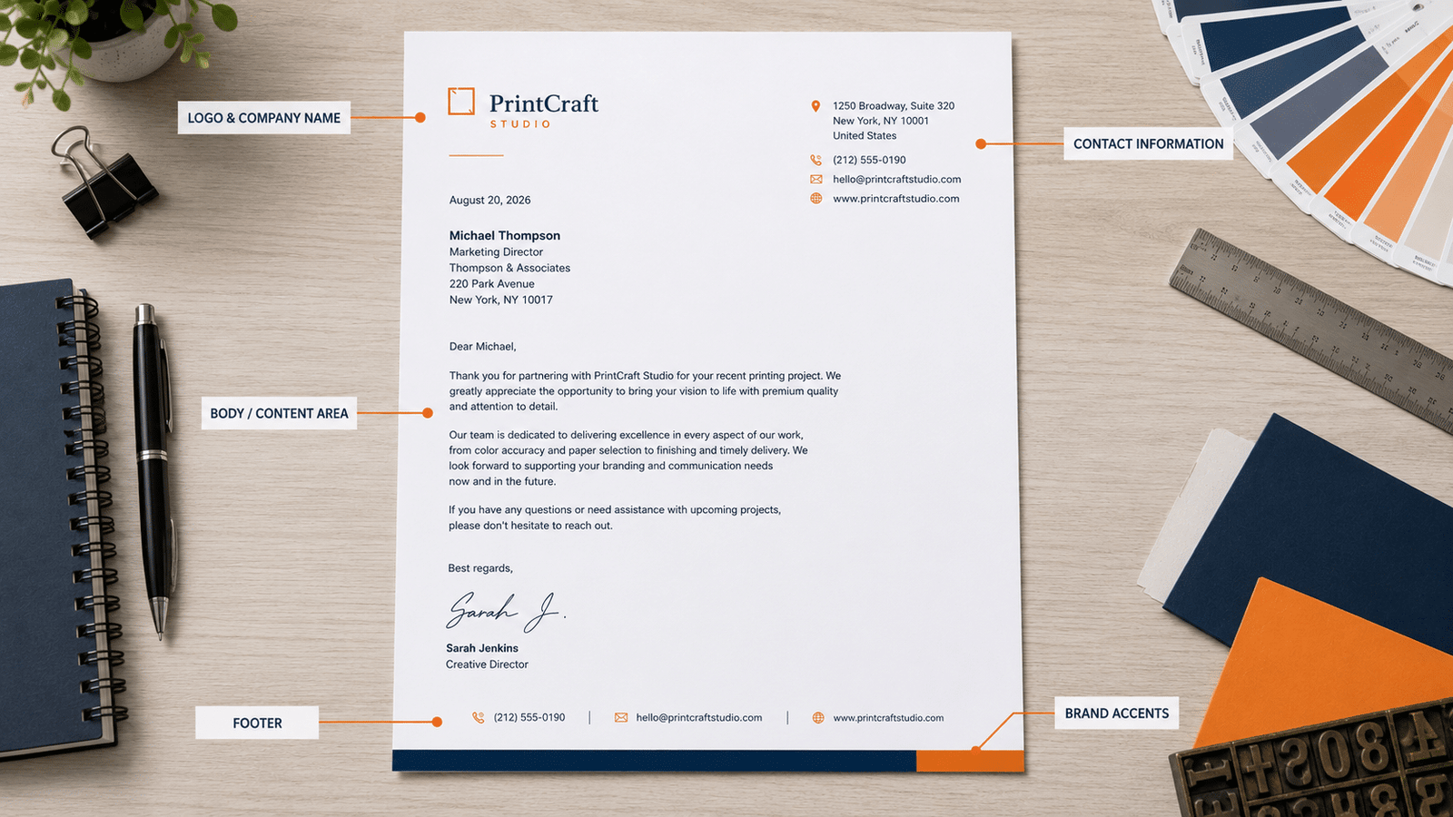
A successful professional letterhead balances branded graphic elements with generous, functional writing space. Every standard design consists of distinct structural zones that work together to present your business identity clearly:
Designing corporate stationery requires selecting the standard paper size matching your geographic business market to ensure pages fit into standard folders, envelopes, and filing systems.
The single most common mistake in corporate stationery layout is placing contact information or logos too close to the paper edge, causing graphics to be clipped during printing or obscured when filed.
To maintain clean proportions and prevent production errors:
The physical weight, opacity, and texture of your paper stock determine how your letterhead feels in hand and how smoothly it feeds through office desktop printers.
To equip your office with high-grade matching stationery, explore our dedicated options for custom letterhead printing produced on premium uncoated and laser-guaranteed paper stocks.
Your letterhead design should frame your corporate message without competing with it for visual attention. Using a disciplined typographic system keeps the page clean and legible.
Maintaining visual brand consistency across multiple departments, branch offices, and team members requires establishing a standardized digital template.
When distributing a company letterhead template across your organization:
A standalone letterhead loses impact if it is delivered inside a plain, unbranded envelope. Creating a unified business stationery suite builds strong brand recall across every touchpoint.
Following standard commercial file rules ensures your corporate colors, delicate watermarks, and fine contact text print with razor-sharp clarity.
Managing administrative stationery expenses across multi-location enterprises requires balancing paper quality with volume ordering.
To optimize your annual stationery budget:
Equipping your business with crisp, professional letterhead requires a commercial printing partner committed to precise trimming, smooth paper stocks, and sharp color reproduction.
At Printin Budget, we manufacture premium corporate stationery designed to help businesses communicate with confidence. Our prepress specialists review your artwork files for proper resolution, margin clearances, and color setups before production begins.
Whether you need a short run of executive letterhead or wholesale quantities for an entire corporate organization, we provide durable paper stocks, rich color fidelity, and dependable service to support your commercial goals.
Connect with Printin Budget to explore paper stocks, verify your artwork specifications, or request a custom printing quote for your project.
Q1: What is the standard letterhead size in North America?
The standard commercial letterhead size in the United States and Canada is 8.5″ × 11.0″ (US Letter Size). For international business outside North America, the standard ISO size is A4 (8.27″ × 11.69″ / 210 mm × 297 mm).
Q2: What paper stock is best for company letterhead running through office printers?
70lb smooth bright white opaque text is the standard choice. It provides opacity to prevent show-through, reproduces fine logos sharply, and is guaranteed laser/inkjet-compatible to prevent jams in standard desktop office printers.
Q3: What margins should be maintained on a corporate letterhead layout?
A standard letterhead layout reserves the top 1.5″ to 2.0″ for the corporate header/logo, maintains a 0.75″ margin on the left and right sides for body copy, and keeps the bottom footer contact details at least 0.5″ to 0.75″ above the bottom trim edge.
Q4: What is the recommended font size for letterhead footer contact details?
Footer contact text (address, phone numbers, email, website) should be set between 7.5 pt and 9 pt. Using larger font sizes crowds the usable message canvas, while sizing below 7 pt can become difficult to read or fax.
Q5: How does bleed apply to custom letterhead printing?
If your letterhead design includes color bars, background patterns, or logos that touch the edge of the sheet, you must include a 0.125-inch bleed on all four sides (canvas size: 8.75″ × 11.25″). If all artwork sits inside the document margins, it can be supplied at the exact 8.5″ × 11″ trim size.
In commercial sales, trade show marketing, and corporate communications, brochures remain one of the most versatile physical collateral formats available.

Selecting the right physical print format is one of the most critical decisions when launching a direct-to-consumer marketing or local

In service industries, field contracting, logistics, and wholesale commerce, generating instant physical documentation during client interactions remains critical for legal